tutorial vectorizacion de imagenes
miren amigos laneros yo ni papa de esto pero ahi les va un tutorial de vectorizacion de imagenes:
Vector Tutorial
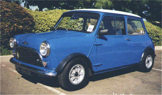
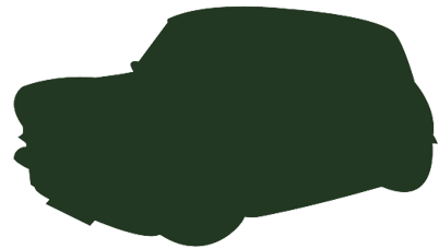
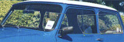
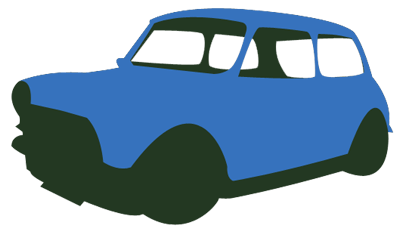
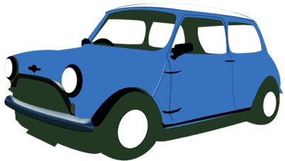
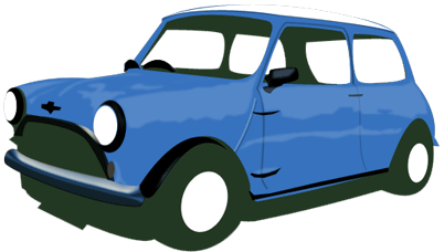
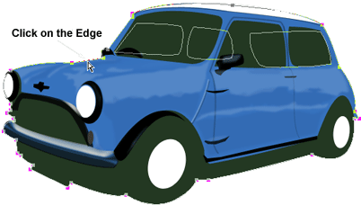
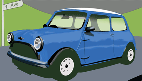
The Image
Below is the image (the mini car) I will recreate to give it the vector look and feel.
The quality of the image is not so much an issue in this case, as long as, theres enough detail to trace.
The Process
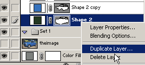
First, right-click and choose either:
A) 'Copy', then inside Photoshop go 'Edit/Paste'. (Photoshop will create a document preset size based on the dimensions of the clipboard image). With this method, Photoshop keeps the default locked 'Background' Layer and pastes the image in a new 'Layer 1' directly above the Background Layer. Double click on the word 'Layer 1' to select the text and give the layer a friendly name - in this case 'theimage'.
Or
B)'Save Picture As' to your hard-drive (Desktop is a convenient location). Then in Photoshop, choose 'File/Open', and browse to that image location (Desktop, for example) to open it. Notice in the 'Layers Palette', the image thumbnail indicates its an 'Index' image (in this case a quick way to tell that this image is a .gif file.) You'll also, notice, its locked. To correct this, simply go to 'Image/Mode/RGB Color' to revert the locked layer to a 'Background' Layer. Optionally, double click the 'Background' Layer in the Layers Palette to convert it into an edit able layer. (Change the default 'Layer 0' to a friendly name - in my case I called it 'theimage'.)
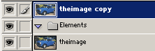
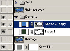
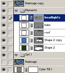
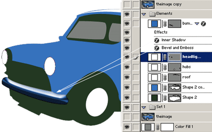
Next, lets duplicate the original 'theimage' layer and if your using Photoshop 7, create a new 'Layer Set' to store all the individual objects(multiple layers). Do so by clicking on the Folder icon at the bottom of the 'Layers Palette', double click on the 'Set 1' default text header and change to what I have (Elements).
The Mighty Pen Tool
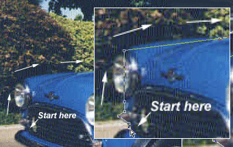
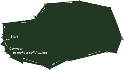
Lets start by creating a solid outline of the whole car.
Set the foreground color by choosing the 'Eyedropper Tool (I)' to sample the darkest area of the image. In this case it's close to black.
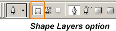
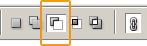
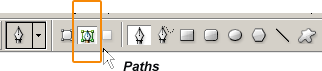
Next select the 'Pen Tool' from the toolbar. And up on the 'Options Toolbar', make sure the 'Shape Layers' option is selected as I have captured (in orange outline).
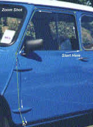
Then just start adding 'Anchor Points' at areas where you think they will require some adjustments.
TIP: Ctrl + (Plus Sign Key) to zoom in and Ctrl + (Minus Sign Key to zoom out on areas that need special detail. I do this a lot to achieve greater detail.
NOTE: By having the 'theimage copy' layer on top, the path outlines show through without disrupting the view of my next anchor point. Throughout this tutorial, I will be toggling visibility of this layer a lot.
Connect The Anchor Points
After making your way around the mini car, connect to the first Anchor Point to create a solid shape. Then hide the 'theimage copy' layer to see what it looks like. (As I have captured.) Then lets start manipulating those anchor points to wrap/fit the mini car properly.
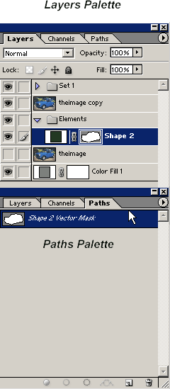
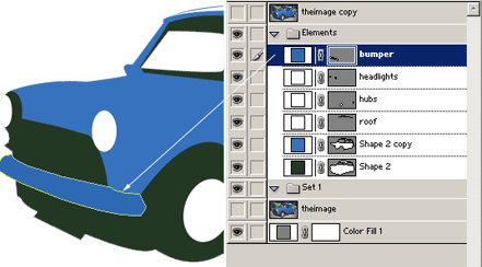
This is what the 'Layers Palette' now looks like, with the new Vector Shape Layer highlighted in blue. Also, if you click on the 'Paths' tab of the layers palette you can see the 'Paths' version of that layer.
Convert Anchor Points
Now turn visibility mode of the 'theimage copy' layer back on.
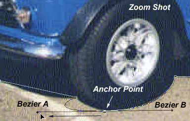
Select the 'Convert Anchor Point' tool and begin wrapping those areas that need curvature to the image.
Make sure the 'Shape 2' layer is selected, in the 'Layers Palette'.
With the 'Convert Anchor Point' tool, I started on the foreground wheel, click the 'Anchor Point', and drag in the direction of my (black) arrow unto it starts fitting the underlying layer.
TIP: 'Convert Anchor Point' creates two bezier handler points, for further curvature control.
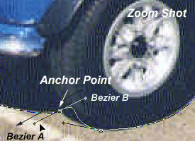
Begin to get comfortable with the 'Convert Anchor Point' tool and work your way around the shape path, trying to get a close a wrap as possible.
TIP: After converting some anchor points, you'll realize that some of the original anchor points were not necessary at all. In fact the fewer the anchor points the smoother the curvature! Use the 'Delete Anchor Point' tool to eliminate unwanted anchors.
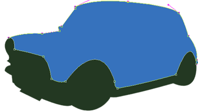
Here's my final shape after applying as much of the 'Convert Anchor Point' tool as possible.
We'll use this for the base (darkest under layer).
Next I duplicated the 'Shape 2' layer (to get 'Shape 2 copy') and manipulated its anchor points to wrap the dominant color of the image, primarily the blue (body) of the car. Click on the Thumbnail Preview of that layer to get the 'Color Picker', and change the black to blue #3672BD.
Now this is what the body of the car looks like.
Next lets work on the windows.
Toggle the 'theimage copy' (black one) back on and hide 'Shape 2 copy' layer (the blue one).
Select the 'Pen Tool (P)' again, and up on the 'Options Bar' make sure 'Subtract from area shape(-)' is turned on.(I have outlined in orange)
Hide 'Shape 2 copy' layer in the 'Layers Palette'.
Select 'Shape 2' layer in the 'Layers Palette'.
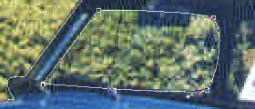
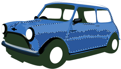
Then start tracing in the areas of the window that are on the opposite side of the car.
Toggle the 'theimage copy' visibility mode to off, to see whats happening.
Your subtracting from the same shape layer, giving the illusion of transparency.
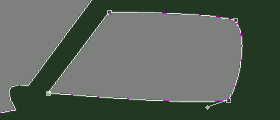
To apply the same affect on the other two windows without adding a new layer, simply hold Ctrl + Alt, then click and drag that subtraction path to duplicate. (Do this twice.) Then place the duplicate shapes into place.
Use the 'Convert Anchor Point' tool again to define the corners to wrap in the right positions.
Note: After the above process, revert the modifier options to its normal state. (Create New Shape Layer)
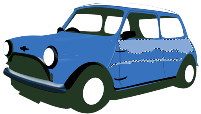
Apply the same technique to the 'Shape 2 copy' layer, except trace along the foreground windows to get a final image as I have captured.(All the while, have 'Shape 2' visibility off.)
Now that we have the crust of the vector shape in place, the rest is simply adding new shapes, lines, and some textures. We'll fill in those windows later!
Giving it depth
Next apply the same techniques as we did creating the base shape layer to the (white) roof of the car. Using the 'Pen Tool (P)' to add Anchor Points, then 'Convert Anchor Point Tool' to create curvature.
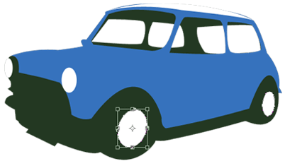
Next, with the 'Ellipse Tool (U)' on the toolbar, draw the back hub cap, then hold the 'Shift' key and draw in a second ellipse(the foreground hub cap).
To position accurately, Ctrl + click on the new ellipse, then right click on a single ellipse and choose 'Free Transform Path'. Right click again, and choose 'Distort'. Tweak the corner bounding points until in the position as the hubs in the image. Repeat for the other hub.
I also started on the headlights (on a new layer) using the same technique. (Ellipse Tool ~ Free Transform ~ Distort ~ tweak into position)
Since new layers are being added and they could pile up, its sensible to name them appropriately. (Thought it is possible here to use as few layers as possible, as I did with the main body)
Next I started adding the bumper. Again, use the 'Pen Tool (P) to trace the area, 'Convert Anchor Point Tool' to wrap perfectly to the original image source. (It's all routine now, right!)
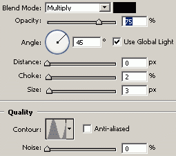
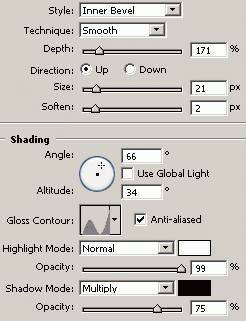
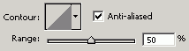
I then applied a layer style to the bumper to give it a somewhat chrome effect.
Right, click on the 'bumper' layer and choose 'Blending Modes' to apply the following three captures.
Next I'll begin to add some of the fine lines that comprise of the doors and other areas.
Select the 'Pen Tool (P)' again, except, this time, up on the 'Options Bar' select 'Paths', as I have captured.
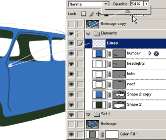
Create a new layer, and call it 'Lines'. This layer should be positioned uppermost in order for them to show.
So, Toolbar - Pen Tool selected, Options Bar - Paths selected, begin clicking/adding Anchor Points in the direction that comprises of the main passenger door.
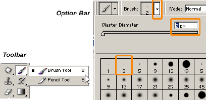
Next set the foreground color to black (hit the D key), hit the (B) key to select the 'Brush Tool (B)' from the 'Toolbar', then up on the 'Options Bar', select the 'Brush Preset Picker' and choose a small, soft edge brush, like 3. But alter the Master Diameter to 2 (try 1 also), since 3 may be too thick.
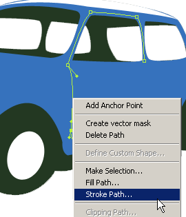
Hit the (P) key to re-select the 'Pen Tool', then mouse over the path you created in the 'Lines' layer, right-click and choose 'Stroke Path' option.
You'll be prompted to choose from a 'Tool Preset' to use to create the new stroke. Select, 'Brush' from the drop down list, then hit 'OK' command.
I then reduced the 'Opacity' of the line layer to 54% to soften it.
I then went ahead (using the same above Pen Tool/Paths/Stroke Path technique on other lines.
I also added the front grill and applied the same style as the bumper above.
Added the mirror the window wipers and the mini logo crest at the front.
HINT: For areas that are too small to be manipulated with the 'Pen Tool (P), use the 'Polygonal Lasso Tool (L)' using the same click and add anchor points as the Pen Tool, then when complete, right click on the selection and choose either 'Make Work Path' or 'Fill' options.
For textures such as the highlights, lets use the 'Polygonal Lasso Tool (L) to trace around those areas that require it, right click and 'Fill', with a soft blue color (I used #86A9D7).
After tracing as much as I can I applied a 'Filter/Blur/Gaussian Blur of 1.1 pixels' (respectively) and reduced the 'Opacity' of the layer to 30%.
On a new layer I did the same Polygon Lasso effect for the darker areas, using #2A579C. Then applied a 'Filter/Blur/Gaussian Blur of 1.1 pixels' and reduced the 'Opacity' of the layer to 30%.
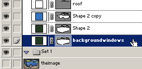
Next I'll add the windows.
For this all we have to do is reuse our original 'Shape 2' for the background windows, and the 'Shape 2 copy' for the foreground windows.
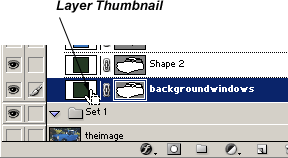
First duplicate the original 'Shape 2' layer and call it 'backgroundwindows'.
Once its duplicated drag it below the original 'Shape 2' layer in the 'Layers Palette', as I have captured.
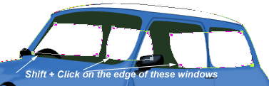
Then hit the 'A' key to select the 'Direct Select Tool' from the 'Toolbar', then hold the 'Shift' key and select the background windows individually.
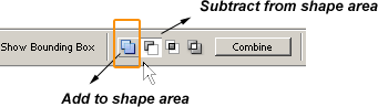
Go to the 'Options Bar' and change the 'Subtract from shape area (-)' to 'Add to shape area (+) as I have encased in orange.
Those window areas will now be filled in with your foreground color, in my case black.
Next, with the 'Direct Selection Tool (A)' still active & still on 'backgroundwindows' layer, click on the outside path line as I have captured and hit the 'Delete' key on your keyboard. Now all we ahve are the windows, which is our goal here. Certainly saves a lot of time drawing them in again.
Now lets customize the windows with a a white tint. Do this simply by clicking on the 'Layer Thumbnail' as I have captured. And change the color to white (#ffffff) in the 'Color Picker' dialogue box. Then set that layers opacity level to about 23%.
Apply the same technique to the original 'Shape 2 copy' layer.
Duplicate, drag below the original, 'Direct Select Tool' and Shift + click to select the foreground windows, 'Options Bar' and switch to 'Add to shape area', then delete the outer path so that the foreground windows remain.
Click on that 'Layer Thumbnail' and change color to white, reduce opacity to about 43%.
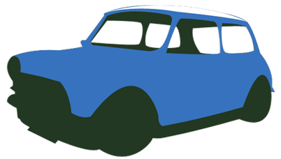
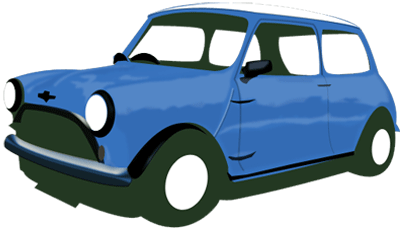
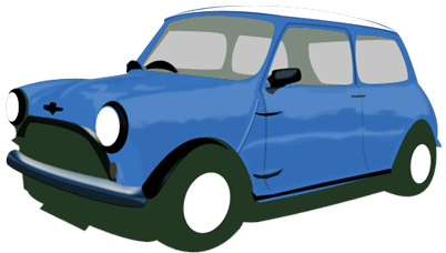
All that remains now are fine details, amount is up to you. Below is my final image after adding detail to the hubs, lights, other highlights. Hope you enjoyed this tutorial.
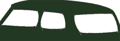
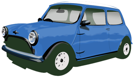
A scenic version.
Originally submitted to
(WM) Webifex Magazine